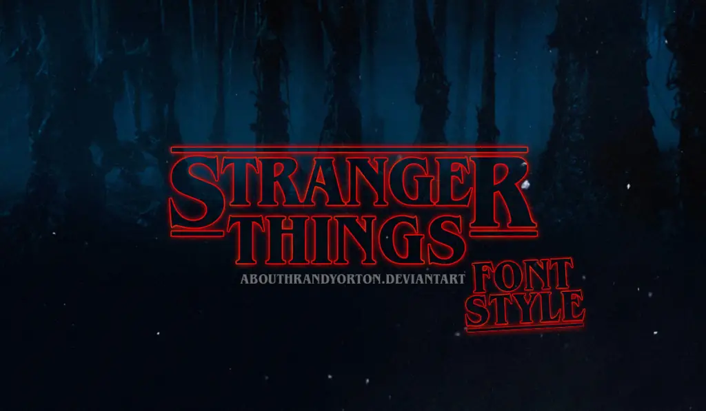
The science-fiction thriller “Stranger things” has become one of the top-rated projects released on Netflix. Moreover, it generated unprecedented reviews and popularity. And everybody who saw the TV show immediately associates it with ITC Benguiat bold font. So why is this font so special and who invented it?
Its author is the American Ed Benguiat. In 1977 he invented a new font, gave it his name, and released it a year later. By the way, the prefix ITC is an abbreviation of the International Typeface Corporation.
The company provided copyright protection for font designers. And Benguiat was one of them. Ed Benguiat created over 600 font designs and is widely known for his logo designs for Esquire, The New York Times, Coke, Estée Lauder, and others.
For the film, the font has been slightly modified by film creators, and the result was stunning. Transparency and stripes in the style of Star Wars have added more mystery and aesthetics to the poster and opening cautions.
Another Font of the Stranger Things
The series used additional font ITC Avant Garde Gothic. It greatly complements ITC Benguiat. Avant Garde Gothic (AGG) has a geometric grotesque design. You can only see it in the opening captions. They have successfully applied the gradient effect, changing the color of this font from white to red.
This font appeared in the late 1970s and was also promoted by the ITC company. If you are looking for the best 80s fonts, here is a great collection.
It is not very clear what was the purpose of Avant Garde Gothic creation. Originally it was used for the Avant Garde magazine, then it was restyled and simplified. And Ed Benguiat was one of its designers.
After all these transformations, the font counted 44 variations. But it is worth noting that each of them stands out in its own way and is suitable for solving different problems.
Main Features of Stranger Things Font
- Recognition. The font seems very primitive compared to pretentious visual effects in other films. But it triggers some subtle recollection in our subconscious. No wonder, as it was used for the titles of almost all horror books, thrillers, and fantastic adventures in an era when Stephen King was the best master of the genre. The film creators mentioned that it was King who inspired them for the film logo.
- Engagement. The neon red color is not just associated with something thrilling. It immediately makes you the participant of the events. The series title appears so scaled on the screen that you can see it from inside. The font makes the audience closer and completely involved.
- Color scale and combination. Successfully chosen fonts are memorable. You photocopy the film in your mind. The font skillfully transfers not only the mood of separate episodes and scenes but the spirit of the whole story.
- Inspiration for designers. Recognition inspires not only the audience but also designers. It led to the creation of the generator of the inscriptions in the style of Stranger Things.
A new season of this mega-popular series is to be released either at the end of summer or in the fall of 2020. And the authors promise the fans will not be disappointed.
