Choosing a suitable typeface for a company is a challenge. Fonts define the mood of not only the lettering but the whole image and support its style. Some fonts are memorized at the subconscious level.
It happens when you often see the same headings or specific words in the text and remember their image, outlines, and shape. As a rule, a person does not read familiar words letter by letter but perceives them entirely.
The same story about Netflix font. Everyone knows this video streaming service and can easily display a printed presentation of the brand on the screen. These are massive red letters that are distinct and easy to read.
What is Netflix logo font?
Netflix font Bebas Neue.
The history of the Bebas Neue font started back in 2005 in the city of Nagoya, Japan. The typeface was created by a designer Ryoichi Tsunekawa, who at first named it Bebas.
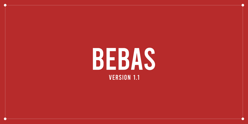
In 2010, he added some new features to the font and gave it a new name – Bebas Neue. Unlike its last option, the Bebas Neue font was replenished with four additional styles: Thin, Light, Book, and Regular.
In 2014, the font was optimized and acquired other symbols, including Cyrillic. Later, in 2018, Bebas Neue became an open-source font, known under version 2.000. It is licensed under the Sil Open Font License v1.1.
Main characteristics of Bebas Neue font-family:
- Font varieties: Bebas Neue Bold (Regular 700), Bebas Neue Regular (Regular 400), Bebas Neue Book (Regular 400), Bebas Neue Light (Light 300), Bebas Neue Thin (Regular 200);
- Font formats: EOT, OTF, SVG, TTF, WOFF, WOFF2;
- Symbol support: Latin letters, Cyrillic, numbers, and punctuation marks;
- Letter case: Uppercase.
Bebas Neue is a grotesque typeface for large, elongated headings and is suitable for art commerce, web, and print.
Netflix Font for Advertising
Previously, Netflix used the Gotham font in their advertising campaigns. But the licenses cost the company a fortune. And in 2018, it designed its proprietary typeface, Netflix Sans, to increase the uniqueness of the service’s appearance.
Netflix’s own design team developed it in partnership with Dalton Maag. You can see the new font on the names of their projects – “House of Cards”, “Stranger Things” and “Ozark.” According to rough estimates, it saved the company several million dollars on purchasing a font license.
What Font is Used for Netflix Subtitles?
Netflix uses the font Consolas for subtitles. Lucas de Groot designed this font, and it is free. Consolas is included in the Microsoft ClearType collection of fonts. It is designed to improve the reading experience thanks to ClearType.
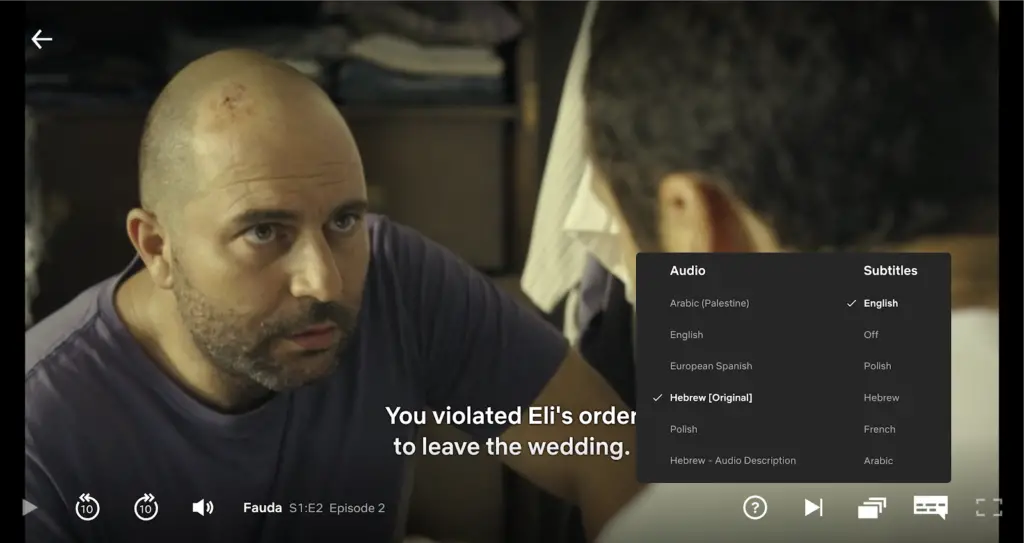
This typeface’s main benefit is that it has character proportions closer to a standard text than traditional monospaced fonts. This font comes in four options – Consolas Italic, Consolas Regular, Consolas Bold and Consolas Bold Italic.
If you find this helpful information, take a minute also to read these articles: