What do a banner and a blog post have in common? The headline. The title is the very first thing you pay attention to when seeing any text. Don’t risk a headline that is not eye-catching enough. It does not matter how good your design project is if the headline does not grab attention.
The major factor which can make or break your title is the font you select. If you choose a font for your headline that does not create the impact it should, your work may pass unnoticed. Choose an appropriate font for the headline. It should be bold, minimalist, yet impactful.
Table of Contents
How to Select the Right Font for a Title?
There are a few things you need to keep in mind while choosing a font for your headline.
1. Make sure the font is readable. Sometimes you need to use the font on a small banner, and it could be difficult to understand what it says. That’s why choosing a readable font for a headline is essential.
2. Remember the context. Think of your target audience when you select a font for a title. A person may get distracted by the decorative font. Always keep in mind what emotions you want to evoke with one or another font.
3. Use a limited number of fonts. When you are creating a poster or flyer, use few fonts. Since all of them need to work together, limit the fonts to 2-3 per page/layout.
4. Combine script and sans serif fonts. Almost all script and sans serif fonts create a beautiful combination. If you have a time limit and need to decide on the fonts quickly, pick one sans serif and one script font to get a winning combination. Besides, sans serif fonts are the best solution for online designs.
5. Don’t pair similar fonts. Your title should stand out from the rest of the design. You can use font size to draw focus to the headline. However, fonts of the same size or height could be confusing. If you have to combine similar fonts, place them far from each other.
Best Free Fonts for Titles
In this showcase, we have put together the best free fonts for titles and headlines. All of them are totally free. However, please, make sure to check the license for every font you download. Some of them require to mention the author in your design, and some of them are free for both personal and commercial usage.
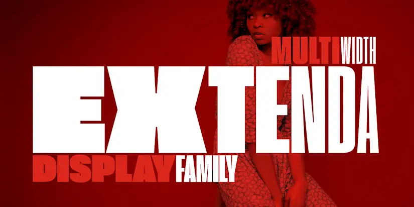
Extenda Free Font
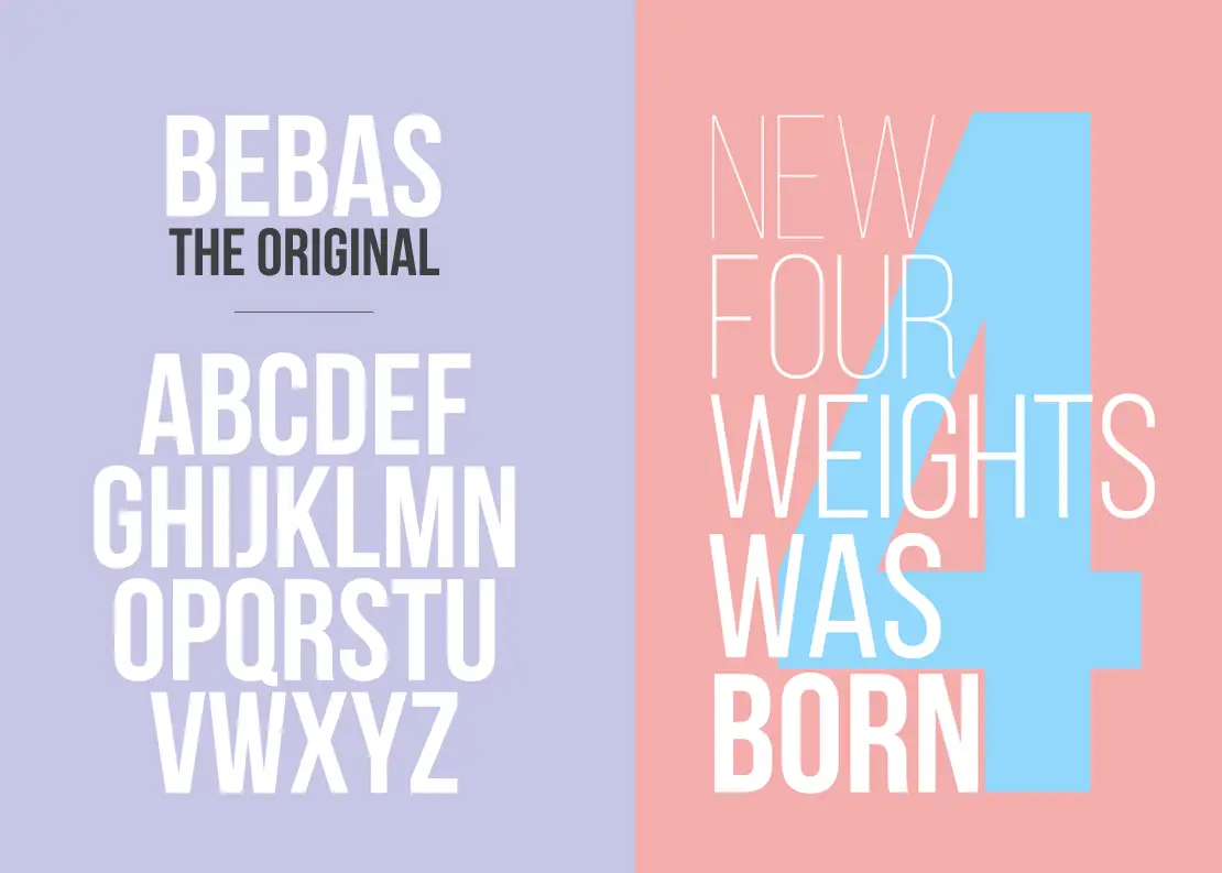
Bebas Neue
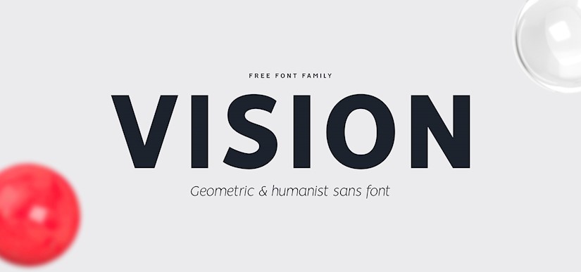
Vision free font
Arista Pro
ANURATI — Free Font

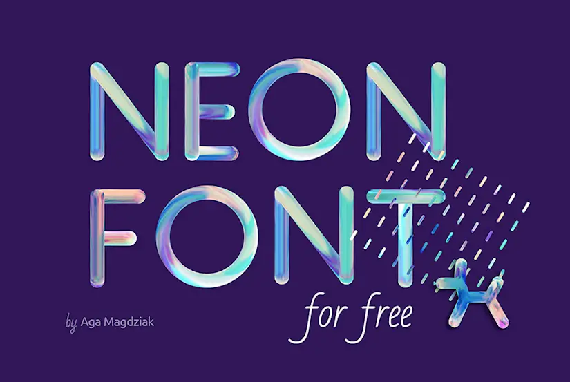
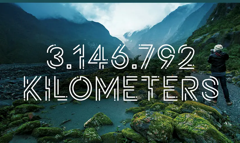
Neon Font
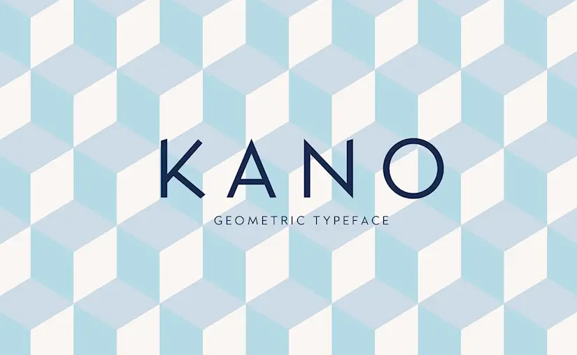
Kano
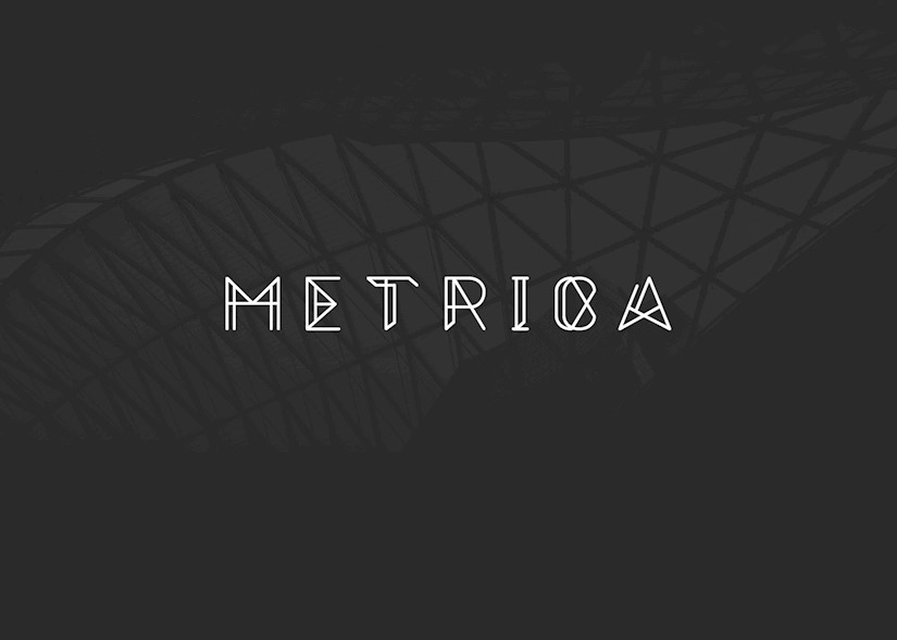
Metrica – Free Font
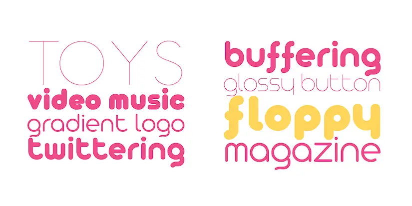
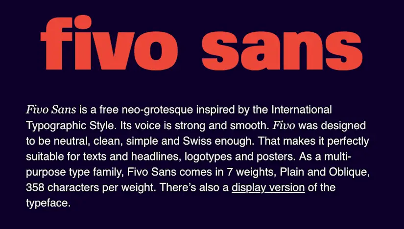
Fivo Sans
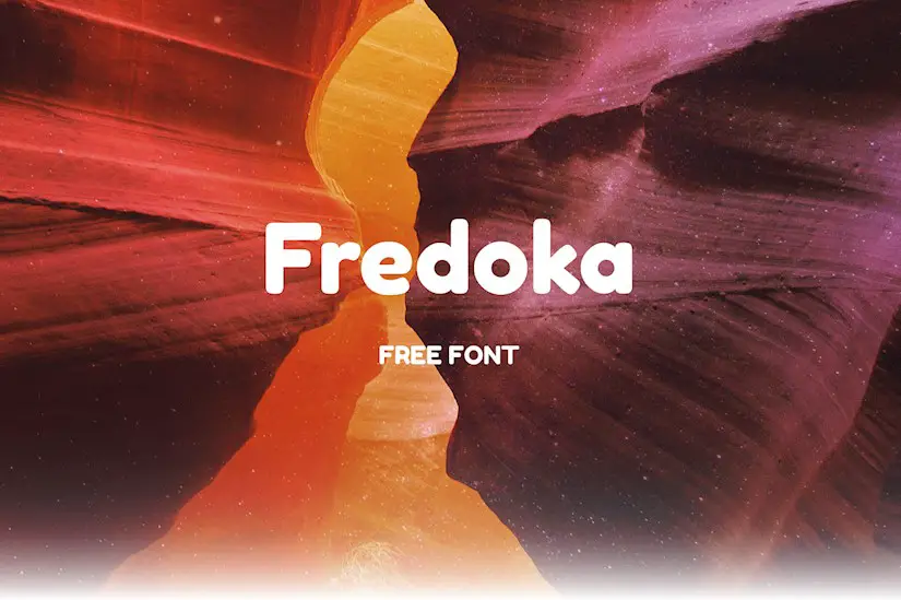
Fredoka – Free Rounded Bold Font
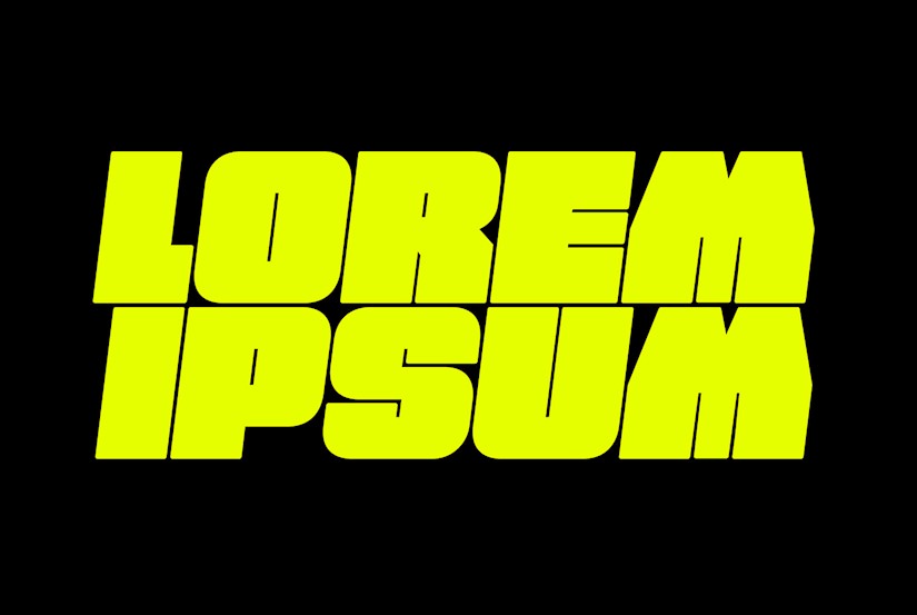
FREE FAT FONT!
Potra – Free Futuristic Display Font
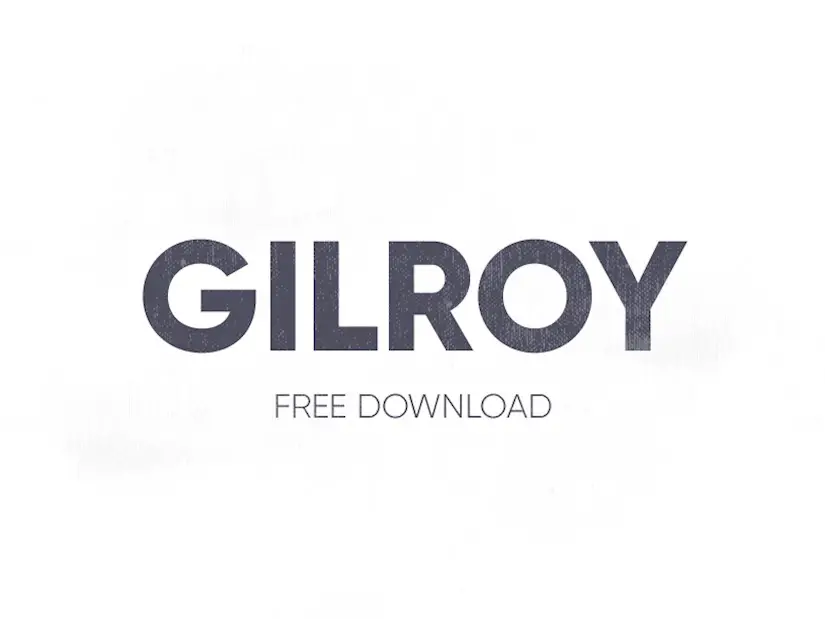
Gilroy Font – Free Download
Krona One
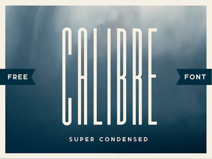
Calibre Super Condensed
WirePop Modern Pop Script

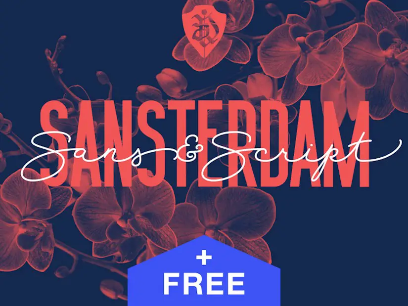
Sansterdam Font family
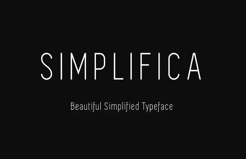
Simplifica
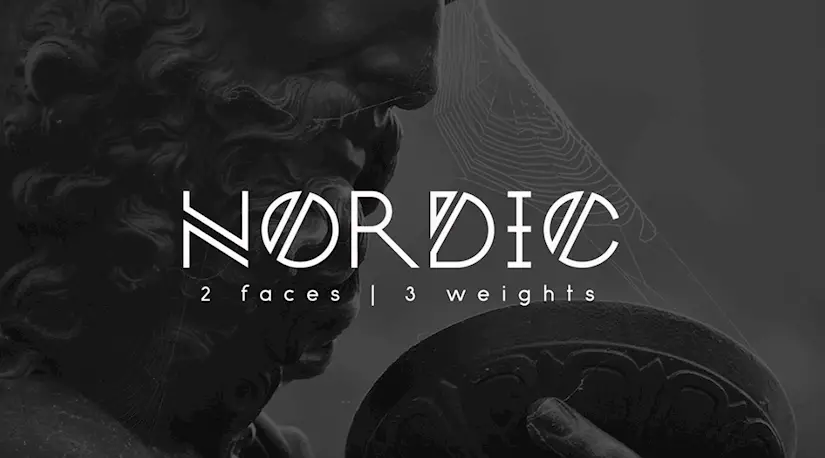
Nordic
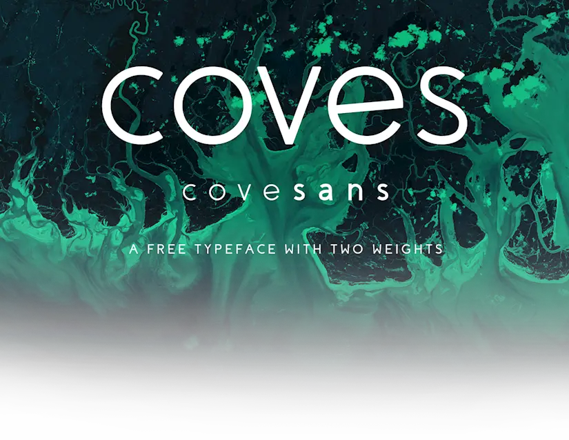
Coves
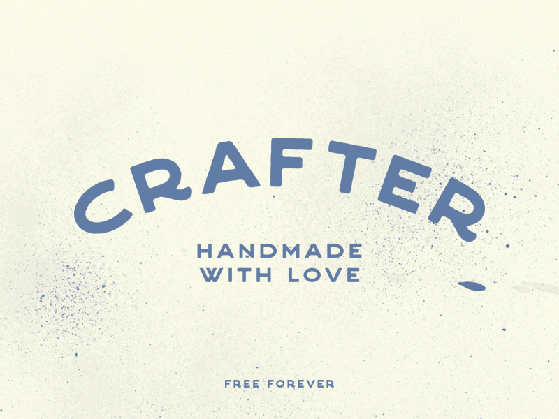
Crafter font
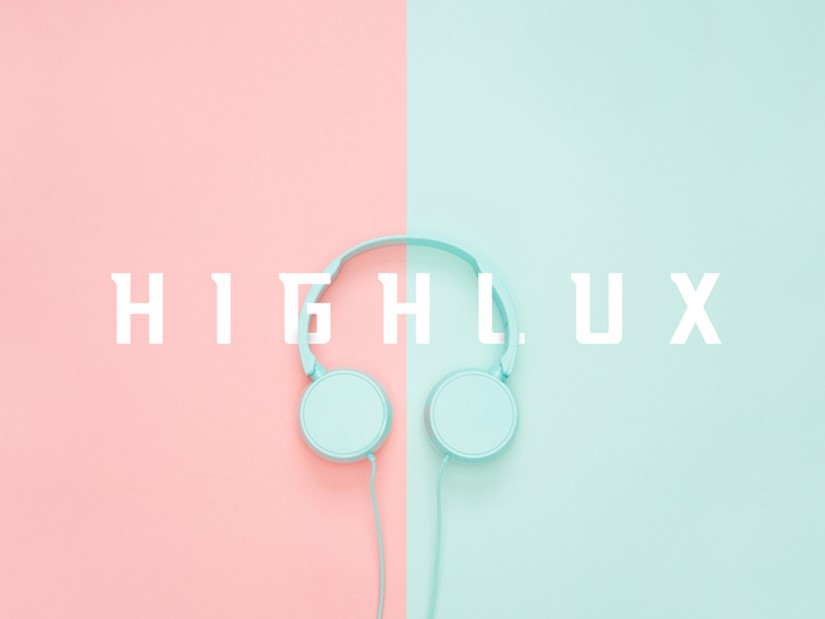
Highlux – Free Typeface
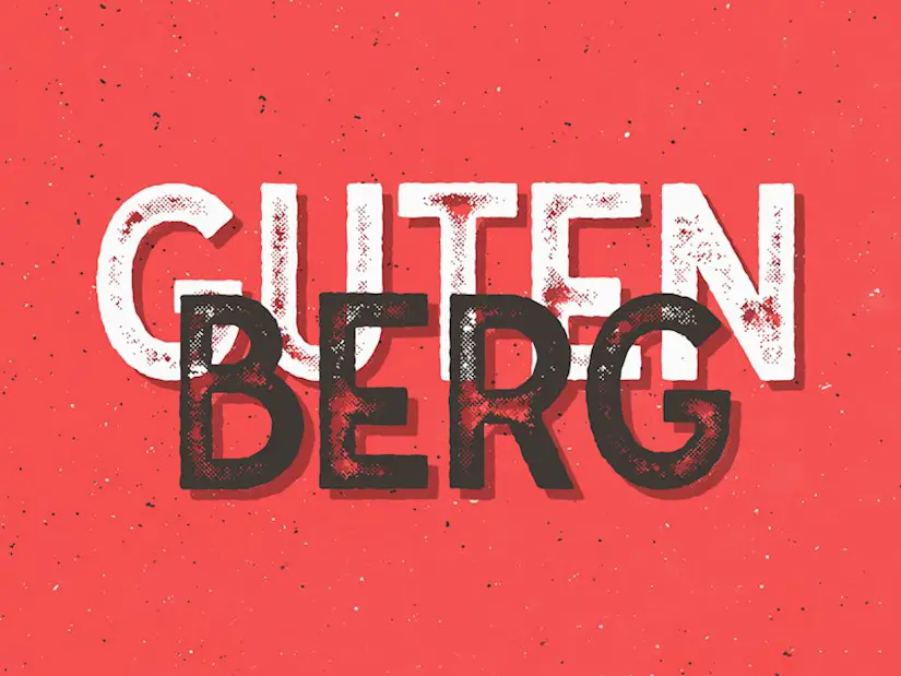
Gutenberg Font Family
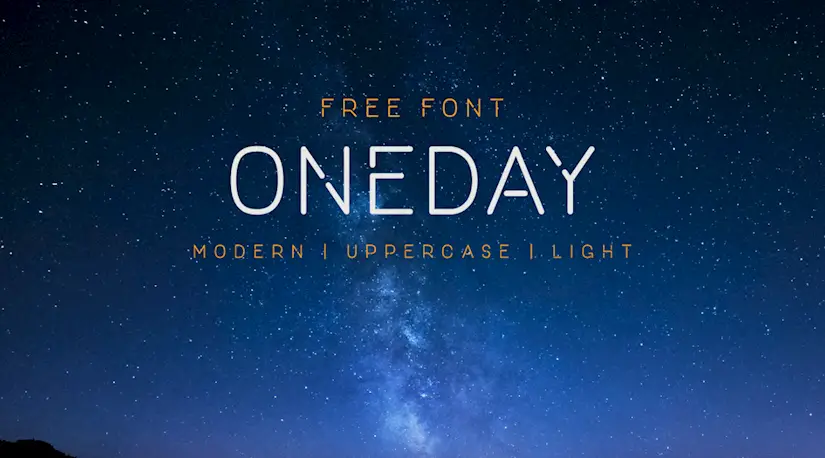
One Day
Brux

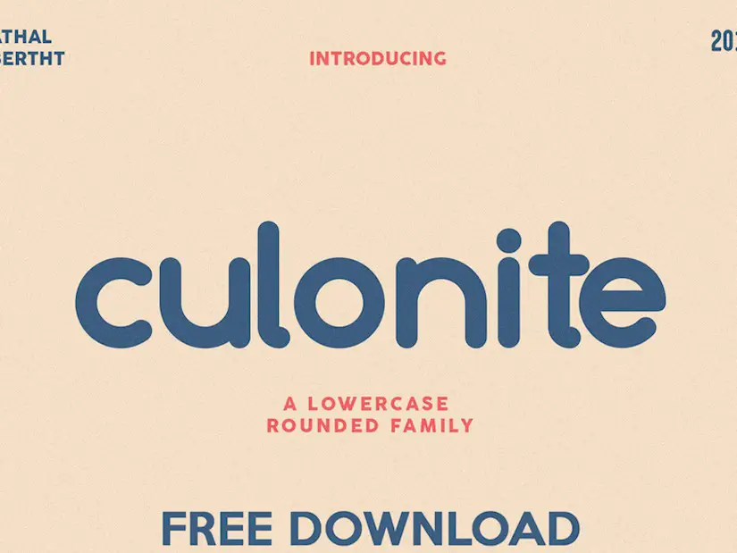
Free Download – Culonite | Lowercase rounded family
Gothvetica
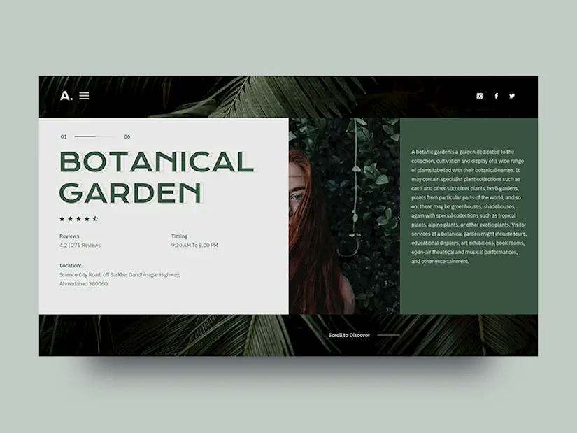
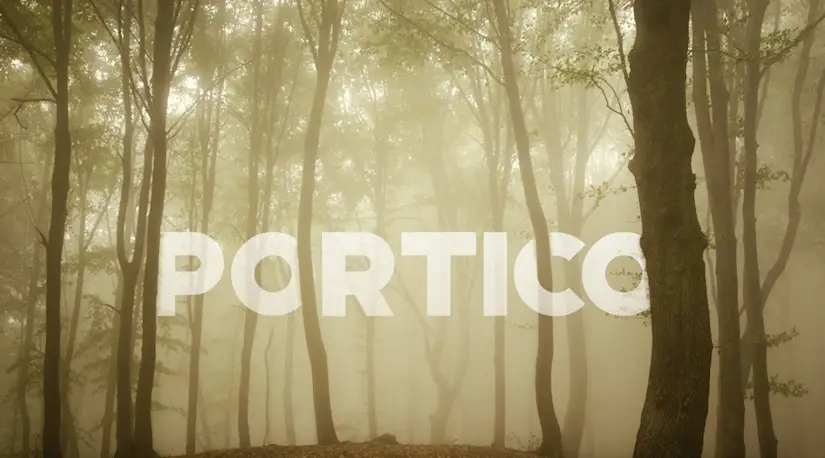
Portico
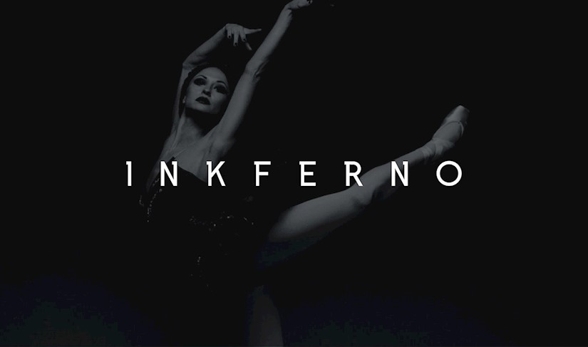
Inkferno
Morganite Typeface Free / 18 Weights

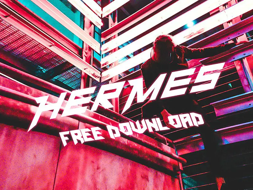
Hermes Font – free
Premium Fonts for Titles
Below you are going find 10 more premium fonts which I believe will be a perfect choice for a headline. You can go to the primary website and download these fonts after the purchase.
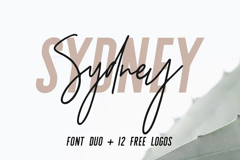
Sydney | Font Duo
Tokyo | A Designer Font Duo
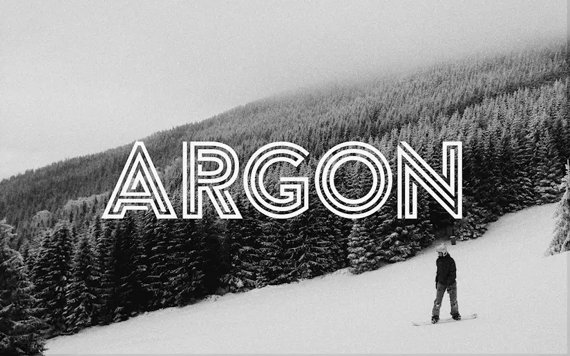
Argon Font (Full)
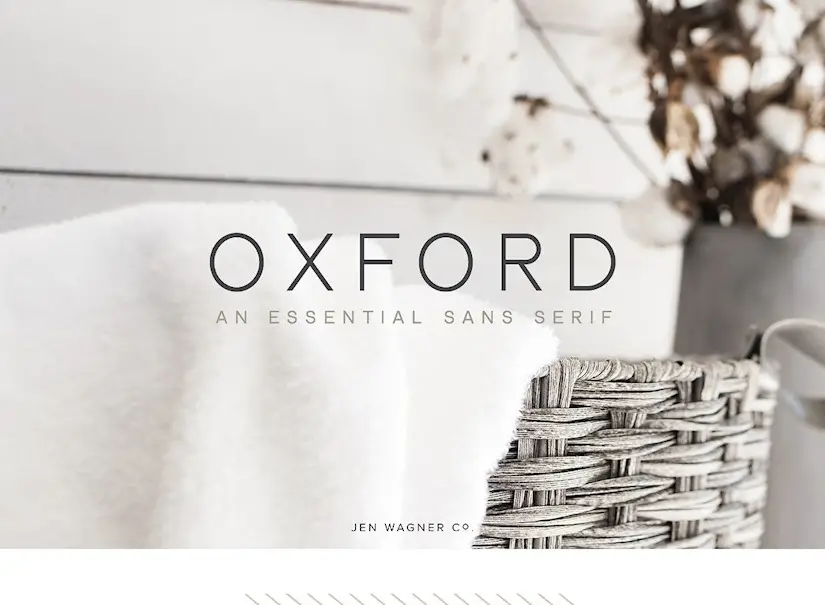
Oxford font
Chloe
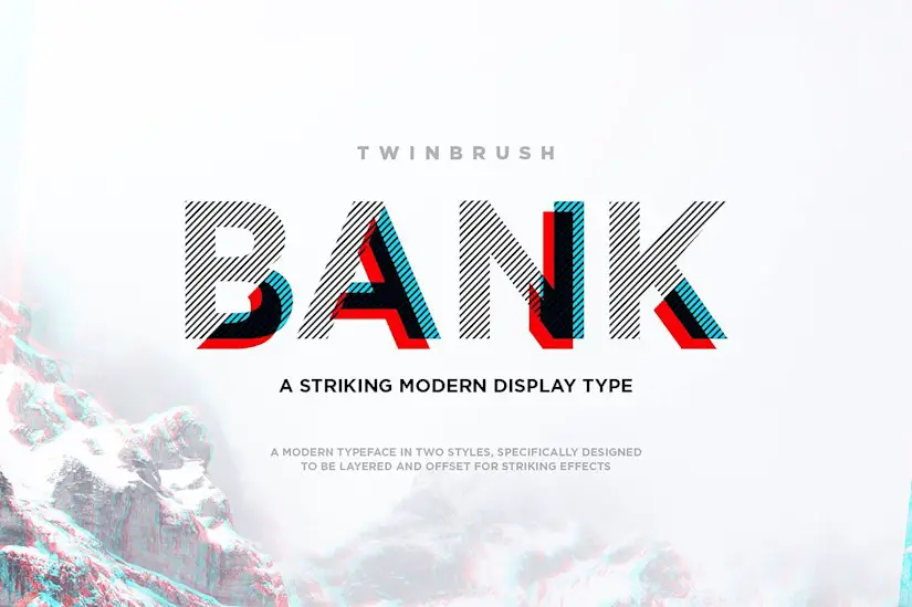
Bank typeface
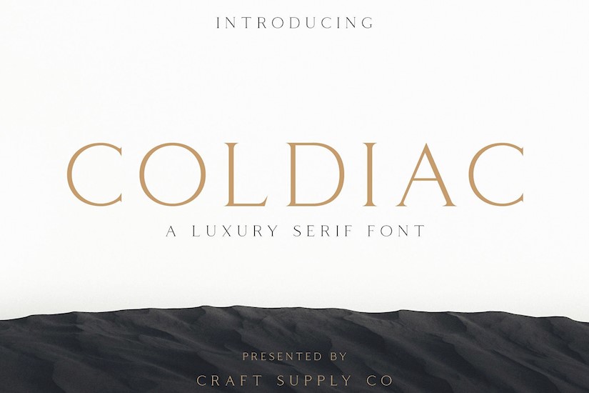
Coldiac – Luxury Serif Font
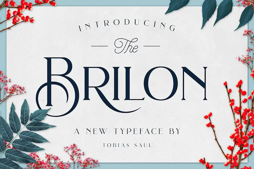
Brilon Font + Extras
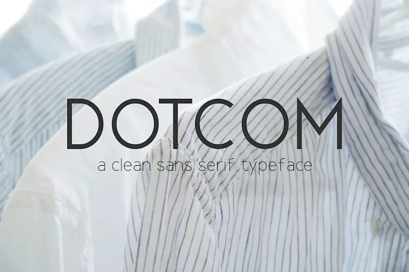
Dotcom Family
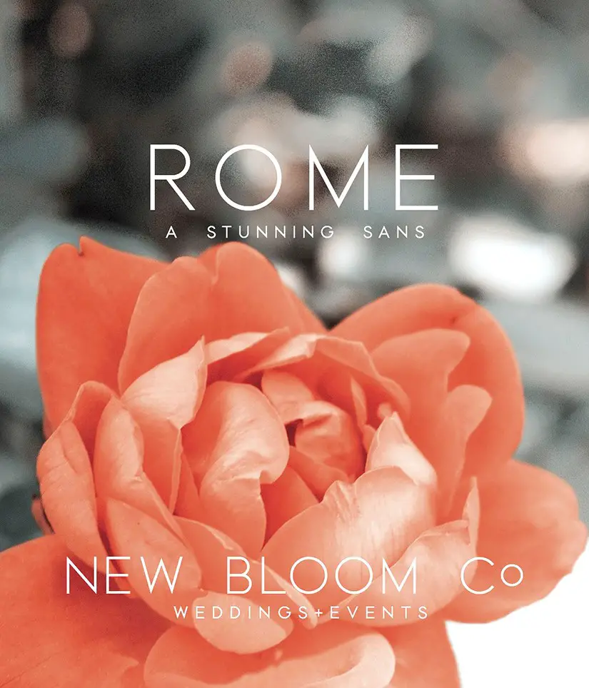
Rome | A Stunning Sans Serif
Over to You
What font from this collection you like the best and why? Share with us in the comment field below. I would like to hear your feedback! Stay tuned, more posts are on the way.